
I Turned My Illustration into a 3D Printed Bookmark
So me and Theo have been on a big reading kick lately. If you don't know, Theo is my desk plant, and he's kind of taken on a life of his own around here. He's been going through books faster than I can keep up, and I noticed I'd been using a napkin as my bookmark. Not exactly ideal. So I thought, why not make something better? Something illustrated, sturdy, and actually worth using. Theo approved the idea, which matters because he's been my pseudo art director lately.
In this post I'll walk through how I made it, from concept to illustration to filament painting and final print. You can also watch the full process in the video above.
What is Filament Painting?
The technique I used for this is called filament painting. It's a 3D printing process that takes flat images and turns them into detailed prints you can actually touch and feel. It captures depth and color layer by layer, so the end result looks a lot like a carving or a decorative tablet. If you're familiar with letterpress, it's a similar idea, except with a lot more detail.

When I first got into 3D printing over a year ago I wasn't sure what I wanted to make. But when I discovered filament painting it clicked immediately. Coming from a 2D background, being able to see my illustrations translated into something physical and textured was really exciting. It's what pushed me to start my Kera Cards, which are tarot-like cards based on my favorite video games. But that's a whole other video.
The Concept
For this bookmark I wanted something with a decorative ornament at the top. My first instinct was to have a dimensional top piece, like an actual 3D plant sticking up above the bookmark body. But when I thought about usability I realized that'd be cumbersome. It would sit awkwardly on a flat surface or stick out of a book in an annoying way depending on the size. I might revisit that idea later, but for this one I went fully flat and illustration forward. I landed on roughly 8.5 x 2.5 inches. Small enough to function properly but enough real estate to display a full illustration.
For the illustration itself, I thought it'd be fun to show Theo watering some of his plant friends. If you follow me on social media, you'll know I've been helping Theo build out his Plantfriendex, which is a guide to his plant buddies and how to care for them. I thought it'd be great to feature some of the entries we've already done in the series.

Illustrating
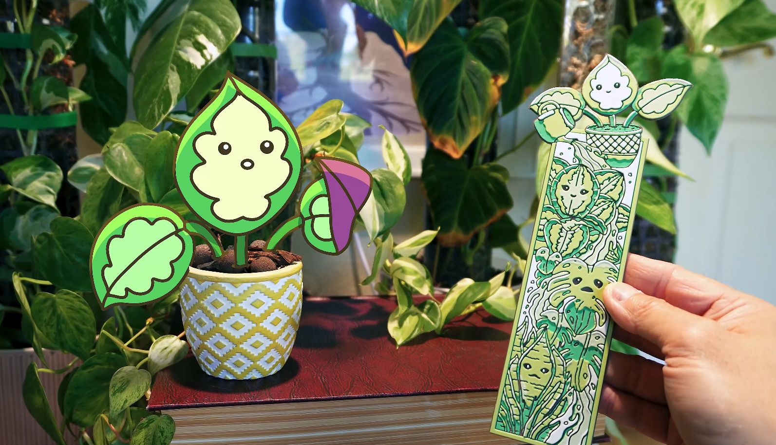
The layout I had in mind was Theo at the top watering three plants below him, with water trailing all the way down and tying the whole design together. Once I had that vertical flow figured out it came together pretty naturally. I pulled the plants straight from the Plantfriendex: the Calathea Dottie, the Monstera, and the Snake Plant, with Theo up top being the caretaker.
For the drawing itself you can use any program, raster or vector. I usually lean toward vector for clean lines, so either Blender or Illustrator, but here I used Photoshop. Since these illustrations already existed from the Plantfriendex, bringing them together was pretty straightforward. The main thing I kept checking myself on was not overcomplicating it. It needed to be detailed and fun but still readable at bookmark size.
Coloring for Filament Painting
This is where things got more intentional. Filament painting isn't like a regular printer. You can't just illustrate in full color and expect it to translate. What you're actually working with is layers, and those layers blend together to produce color. Some people bring in photos or full color images and print directly, which works, but you really need to think in terms of how many filaments you can accommodate to get the result you're after.
The approach I've settled on is working with a limited palette, just four colors, and thinking in terms of value rather than specific hues. This was familiar territory for me. I've always loved a toon shaded aesthetic, both in my 3D work and in 2D illustration, so working with flat deliberate values instead of gradients felt natural. When the values are right, four colors doesn't feel limiting at all. It actually gives you more control over the end result.
I colored the illustration in greyscale values first, then chose my filaments. I wanted the bookmark to be predominantly green, so I landed on green, yellow, brown, and white. Green as the main color, yellow to brighten and warm it up, brown to darken things in an earthy way, and white as the light neutral. The key thing to remember is that filament painting doesn't print those colors directly. It's always a mix. Green and yellow don't sit side by side, they blend in thin layers. So you're always thinking about what's underneath and how it affects what's on top.
HueForge
Once the illustration was ready I brought it into HueForge. HueForge is software that controls exactly when your printer swaps filaments and on which layer. It has a lot of options to fine tune the result and gives you a live preview of how your layer sequence will look. I know Maker Lab released something similar called Chroma Canvas and I've played around with it, but I keep coming back to HueForge for the customization.
The key thing to understand is that you're not assigning colors to specific areas of the design. You're assigning them to layers, and sequence is what matters. I set brown as the base, then green, then yellow, then white on top. Building from darker values to lighter ones gives the greens a lot more vibrancy than going the other direction. HueForge gives you a live preview and you can adjust the number of layers to control how prominent each color is. Once I was happy with it I exported the STL, brought it into Bambu Studio, matched my filament slots, set my specifications to match my HueForge settings, and sliced it. HueForge also gives you a color change map, which tells you exactly which layers to swap on, and you plug those into the slicer. Then you send it to print.
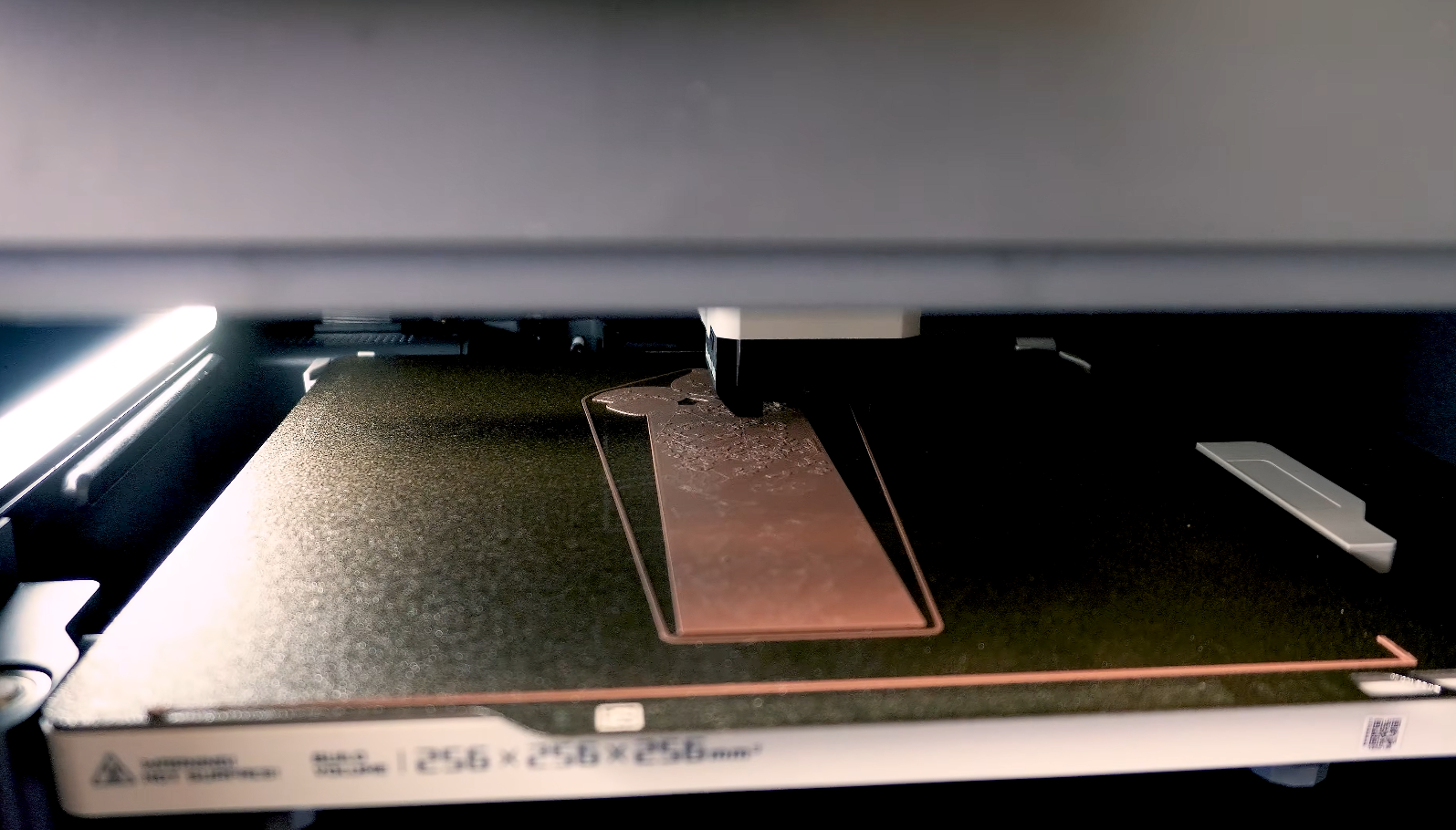
Printing
This is always the scariest part because it's an unknown. Depending on the size of your print you're looking at anywhere from three to six hours. This one took about four.
It came out clean on the first try, which felt really good. When I pulled it off the bed I could immediately see the layering doing exactly what I intended. The greens had depth, the brown was grounding the whole design, and the white was hitting the highlights just right. It reads like an illustration but physical, something you can hold and feel the texture of.
The Final Bookmark
Here it is. Theo's at the top with his little watering can and his plant friends cascade all the way down below him. In person you can really feel the texture. It doesn't just look like a print, it feels like an object. Theo approved, art director duties fulfilled.
I enjoyed this process so much that I made a second bookmark too, this one featuring Theo and the legendary Monster Monstera, inspired by a stylized scene I did with him a while back. I'll be doing a breakdown of that one as well so keep an eye out for that.
Both bookmarks are available in my shop at kevandram.com and on Etsy if you want to grab one for yourself.
Watch the Full Process
If you want to see the full build from illustration to final print, I walk through everything in the video above. And if you have any questions about the process, drop them in the comments on YouTube. I also have more filament painting and 3D printing videos on the channel if you want to go deeper.
Thanks for reading, and I'll see you in the next one.
◈ MY 3D PRINTER & TABLET ◈
(Affiliate links help support the channel at no extra cost)
Bambu Lab H2C (The Featured Printer): https://tidd.ly/4vikoze
Bambu Lab P1S (My Original Printer): https://tidd.ly/3PmwOpo
Bambu Lab P2S (Newest Version): https://tidd.ly/4sRLgny
XP Pen Artist 16: https://tidd.ly/43m9qfV
Kevin Ramirez is a designer and independent creator based in Los Angeles. He runs Kevandram, a creative studio building an original IP world through 2D/3D art, 3D printing, and new creative technology — documented publicly one project at a time.
🎥 YouTube: youtube.com/@kevandram
🛍 Shop: kevandram.com
📦 Gumroad: kevandram.gumroad.com
📷 Instagram / TikTok: @kevandram
🌐 Website: kevinramirez.com